Submitted by PRWatch Editors on
-- by Gaius Publius, Professional Writer and Contributing Editor at AMERICAblog.com
 America's income inequality has grown so wide that the current "recovery" is driven primarily by the upper fifth of income earners, as revealed by the latest consumer spending data. Right now, more than 60% of all consumer spending is done by just the top 20% of income earners. And retailers are noticing.
This is the America that's in recovery. Who is part of that 20% with most of the spending money? First, obviously, are the bigs (the Kochs, the Edelsteins, the Rubins and Dimons, the hedge fund kings and queens). The next level down includes their top retainers (those who are paid -- or campaign-financed -- to serve their financial interests ... people like, well ...). And finally, there's the broad class of well-paid and needed professionals, those who get the real trickle-down, who earn real money when the economy is good. Doctors, lawyers, high-tech pros, engineers, sales types, the people at the airport on a weekday. Everyone with a needed skill who keeps the machine running and whose job can't be outsourced.
Inflation-adjusted incomes below that point have collapsed, or gone flat with barely a hint of recovery. We'll show this data in two ways below. Read on.
Consumer Spending Data Shows Where the Money Is
Much of this is revealed in a study of consumer spending as described in a recent New York Times article. First, the money quote, then more from the article. The quote:
[T]he current recovery has been driven almost entirely by the upper crust [the top 5% of earners], according to [the study's authors] Mr. Fazzari and Mr. Cynamon. Since 2009, the year the recession ended, inflation-adjusted spending by this top echelon has risen 17 percent, compared with just 1 percent among the bottom 95 percent.
More broadly, about 90 percent of the overall increase in inflation-adjusted consumption between 2009 and 2012 was generated by the top 20 percent of households in terms of income, according to the study, which was sponsored by the Institute for New Economic Thinking, a research group in New York.
The study mentioned above is fascinating but technical. Reading the write-up in the Times will get you well started. It puts numbers to an otherwise amorphous entity, "rising income inequality."
Most Consumption Occurs At the Top
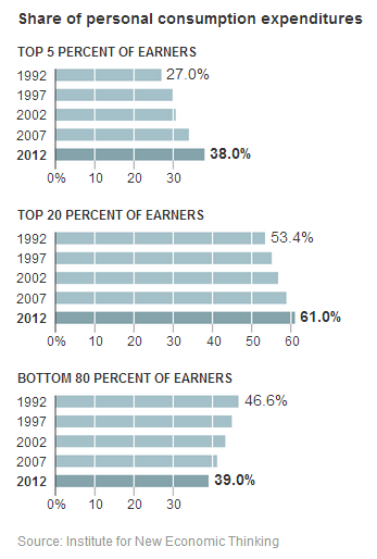
The section just quoted covered change in consumption. There's also information about the amount of consumption itself, divided among the various moneyed and un-moneyed classes. Take a look at this chart, especially the three 2012 bottom lines:
From the top part of the graph, we find that the top 5% of income accounts for almost 40% of consumption. That's stunning in itself. From the middle part, we see the top 20% of income now accounts for more than 60% of consumption. And from the bottom, the other 80% of the nation by income -- all of the rest of us -- account for less than 40% of consumption. And again, as the graphs show, the trend is widening.
The Vast "Shrinking Middle"
All of this means that the buying power of our vast middle class is shrinking, and with it the wealth of the companies that depend on it. The article is filled with examples of higher-end products and retailers doing well, just like the very low end (like Dollar Tree) which serves the near-destitute. Meanwhile retailers in the middle are seeing a ton of trouble -- dwindling sales, store closings and plummeting stock prices. A taste from the article:
Investors have taken notice of the shrinking middle. Shares of Sears and J. C. Penney have fallen more than 50 percent since the end of 2009, even as upper-end stores like Nordstrom and bargain-basement chains like Dollar Tree and Family Dollar Stores have more than doubled in value over the same period.
The same trend is true for restaurants, where middle class brands -- think Olive Garden and the like -- are hurting. At Olive Garden (average bill of about $16 per diner), revenue is falling. At Capital Grille (average bill of about $70 per diner), revenue is up.
The Nation's Median Income Is Still Under Water
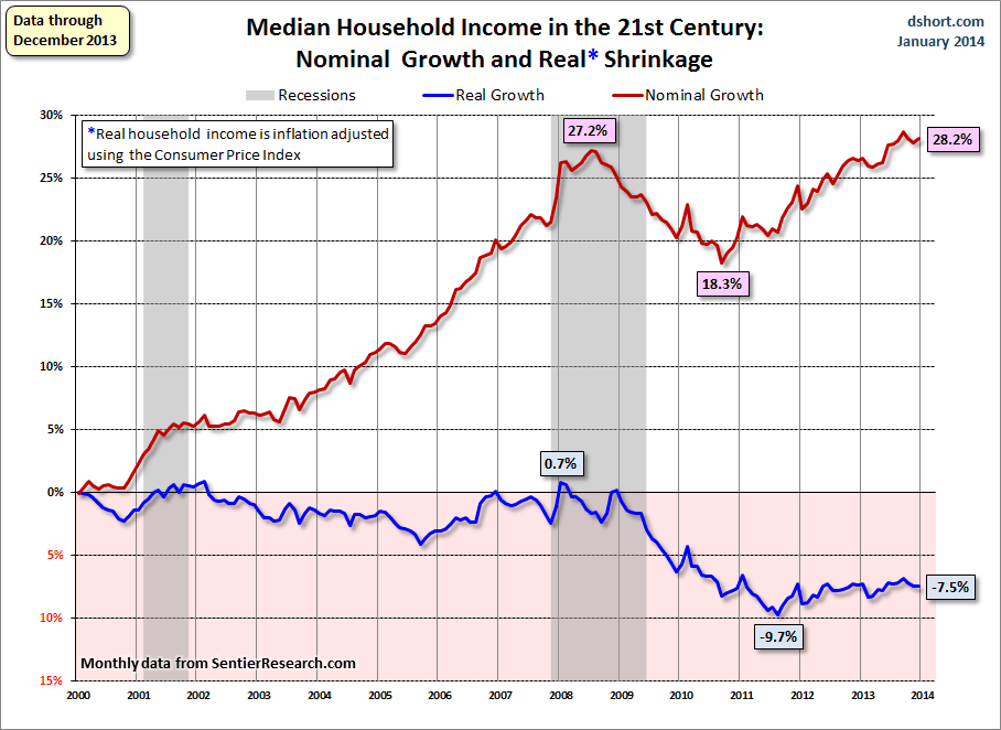
Another way to see our widening income inequality is by looking at the following chart, published by Doug Short at his excellent analytic site. Short compares "nominal" growth in the nation's median income -- "nominal" means using the raw, non-inflation-adjusted numbers for each month and year -- to the inflation-adjusted, or "real," income numbers. The period covered is January 1990 through December 2013.
 Keep in mind, this data represents the exact middle -- the 50% mark in household income -- a proxy for the very middle of the middle class. People above the 50% line are doing better than this. People below the 50% mark are doing worse. Here's the chart enlarged:
While the red line (unadjusted income) shows nominal improvement, the inflation-adjusted numbers are terrible. The median income, the exact middle, fell to nearly -10% after the 2008 crash, then "recovered" to only -7.5%. The middle income earner has lost a lot of buying power since the 2008 recession, and she's still very much under water. No recovery there. No wonder Sears is closing its flagship Chicago store, while Nordstrom's business is booming.
I wonder -- how far above the 50% line do you have to be, for your blue line to have climbed back simply to zero? Short doesn't say, but I suspect it's close to the top-20% mark.
Short's comment on this information:
[This] chart is my preferred way to show the nominal and real household income -- the percent change over time. Essentially I have taken the monthly series for both the nominal and real household incomes and divided them by their respective values at the beginning of 2000. ...
The stunning reality illustrated here is that the real median household income series spent most of the first nine years of the 21st century struggling slightly below its purchasing power at the turn of the century. Real incomes (the blue line) hit an interim peak at a fractional 0.7% in early 2008, far below the nominal illusionary peak (as in money illusion) of 27.2% six months later and now at 27.8%, just fractionally off its new high of 28.7% set in September. In contrast, the real recovery from the trough has been depressingly slight.
Tales of the carved-out middle, and two ways to see it.
Economic Growth Could Be Flat At Best For Years
Mr. Fazzari, at some point in the Times article, says: "It's going to be hard to maintain strong economic growth with such a large proportion of the population falling behind." True on its face. If no further shocks occur, if the wealth and income divide widens no further, and if the median earner continues to recover a meager 2.5% of earning power every two and a half years, then in about eight years -- 2022 -- that person will be at the break-even point relative to 2008, or 1990. She will have made it back to "zero" after the crash. In other words, no income improvement in 32 years, a whole working lifetime.
There are a lot of ifs in the sentence above. To start with, of course the wealth and income divide will widen. After all, that's the goal of the "1% Project" in its entirety -- to make it widen. Now consider an added thought. Picture that widening wealth gap, then imagine the state of the economy when the generation that owns nothing but a small 401k and no pension goes into retirement, and shortly after that, into poverty. That generation is in its 50s and 60s now, waiting in the wings.
The poverty rolls will swell, while the top 20% -- and only they -- go shopping. I often ask myself: At this point, do the rich really need the rest of us? If by "us" you mean middle-class Americans, the answer is likely, "No, not any more."
This is an expanded version of an essay that originally appeared at Americablog.com.

